Time series data is a sequence of data points collected at regularly spaced intervals over a period of time.
Examples of time series data include:
- Stock prices
- Sales figures
- Topic trend growth
- Temperature readings
- Website activities (e.g., conversions, page views, etc.)
- Health monitoring (e.g., EKG, body temperature, etc.)
Investors, executive leadership, and other stakeholders who make decisions and projections based on time series data aren’t usually the ones with the technical skills to interpret it. Instead, they rely on data visualization tools to help them quickly understand what the numbers mean.
Here are the three best ways to visualize time series data.
1. Line Graphs
A line graph is one of the most straightforward ways to visualize time series data. As the name implies, it’s a graph that displays data as a series of connected points, or lines.
The dependent variable (i.e., the one being measured) is plotted on the vertical axis, and the independent variable (i.e., time) is plotted on the horizontal axis. This allows you to see how a particular variable changes over time.
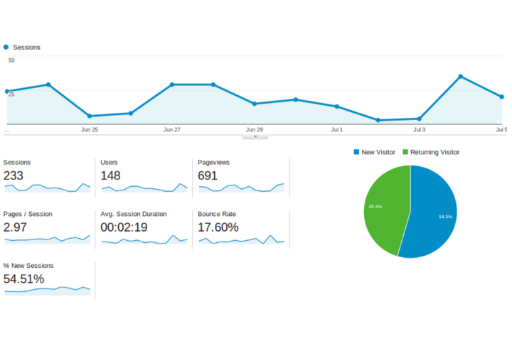
Line graphs are excellent for visualizing data that is continuously changing. In the example above from Google Analytics, the user can clearly see how many users interacted with their site from one day to the next.
Had this data been reported using a bar graph, determining a trend from these changes would be more difficult.
Other excellent uses for line graph visualizations include:
- Tracking the performance of a project or product over time
- Charting energy usage in a home or business
- Generating trend reports to understand customer behavior, such as number of page views per day or total sales per month
- Monitoring the popularity of a topic, hashtag, or keyword
2. Bar Graphs
Bar graphs are another one of the most common ways to visualize time series data. Unlike line graphs, bar graphs use vertical or horizontal bars to represent different values at different points in time.
Since they don’t require you to connect individual points, bar graphs are ideal for visualizing data that changes at discrete intervals (e.g., monthly sales figures or quarterly profits).
Bar graphs can also be useful for comparing two different sets of data at the same point in time, such as revenue from two different regions or customer satisfaction ratings before and after a product launch.
There are three types of bar graphs:
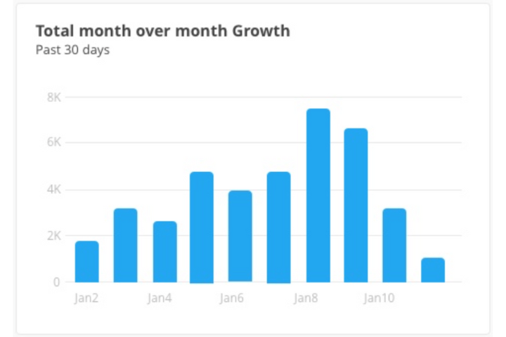
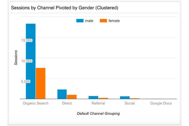
Multivariate Bar Charts
A multivariate bar chart is the best visualization to use if you need to compare multiple variables at once. To compare multiple variables against the same metric, each bar would be a different color, with a legend to explain what each color stands for.
Univariate Bar Charts
This type of bar graph compares one variable over a period of time. You would use a univariate bar chart to compare sales from the last month to the previous month, for example. The length of each bar represents the magnitude of the value.
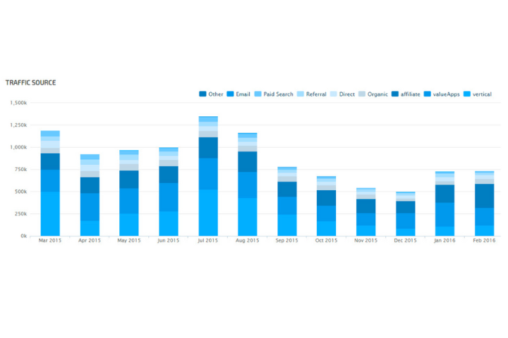
Stacked Bar Charts
Stacked bar charts compare multiple variables as proportions of the whole. If you wanted to compare the number of sales for each product type over a period of time, for example, the length of the bar would represent the total sales for that month, and the colors of the bar would represent each product’s share of those sales.
3. Area Graphs
Area graphs combine elements of bar graphs with the overall look and feel of a line graph. In an area graph, the area between the line and the x-axis is filled in with a color or pattern to indicate magnitude.
Like line graphs, area graphs visualize change over time. But the space between lines in an area chart is filled to show how one or more values change over a period of time.
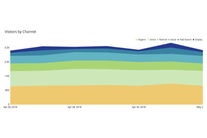
Area graphs clarify data, making them easy to digest and interpret. They’re particularly helpful when it comes to comparing data sets that have different magnitudes, such as a year-to-year comparison of sales figures or the number of page views by month.
The best times to use area graphs include:
- The data is expressed as a total.
- You need to compare multiple sets of data.
- It’s important to illustrate how one value changes relative to another, not just individual values.
- Multiple data series have part-to-whole—i.e., cumulative—relationships.
Final Thoughts on Time Series Visualization
There are numerous ways to visualize and interpret time series data. Other methods include bubble charts, heatmaps, and scatterplots.
Area, line, and bar graphs are the easiest to read and interpret and are the best ways to start—especially if you’re new to data visualization. Experiment with different types of visualizations to find which ones work best for your specific use case.
As a general rule of thumb:
- Use a line graph to report continuous data over time.
- Use a bar graph to compare values for different points in time or between different groups.
- Use an area graph to compare multiple sets of data or to show part-to-whole relationships that are continuously changing.
Most importantly, remember that time series data visualizations should always be tailored to the audience they’re targeting—simplicity is key. Data visualization is an incredibly powerful tool for understanding complex information quickly and easily, but using the right visualization for the right data is critical.